Animatics from fahminaali on Vimeo.
Wednesday, 31 March 2010
Animatics Of Music Video
An animatic is a rough version of the product in which we are creating. In this case, our animatics are of our music video. This draft shows the shots and images we are hoping to portray through our music video, through the use of hand drawn drafts of scenes.
Friday, 26 March 2010
Final Cut
This is our final cut of the music video for Nightmare by The Ghost Frequency.
FINAL CUT from Lucy Simonds on Vimeo.
Thursday, 25 March 2010
Feedback - Social Networking Site
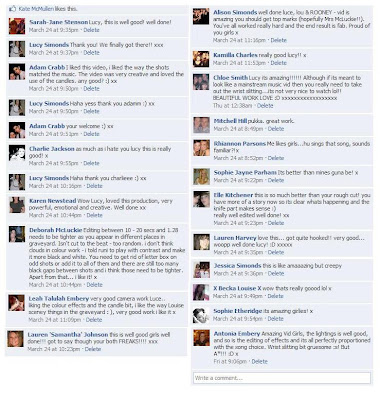
After making changes to our rough cut for our music video, and once we were happy with it, we then uploaded the video onto a video hosting website (Vimeo). We then was able to post the video on to Facebook and ask for feedback from our friends and family.
This is the feedback which I received: Overall I was really happy with all the valuable feedback which I received. The one criticism we got back was about some of the timing of the quick cuts within the video which we then rectified. My family were very proud of what I had achieved and thought the video was amazing!
This is the feedback which I received:
 Overall I was really happy with all the valuable feedback which I received. The one criticism we got back was about some of the timing of the quick cuts within the video which we then rectified. My family were very proud of what I had achieved and thought the video was amazing!
Tuesday, 23 March 2010
Initial Audience Feedback
In order for us to get some audience feedback, we initially asked our teacher and class mates to tell us their opinions on our rough cut of the music video, as well as our designs for the digipak and website.
The feedback we received from them about our rough cut is that they found it very repetitive and they therefore felt it was too predictable as to what was going to happen next.
The feedback we got for the website was positive. However, some people felt as if the images used could be changed from colour to black and white so that they related more to the music video.
The feedback we gained about the initial digipak was that it did not include the conventions of a real life digipak as it looked very messy and the pictures did not relate to the music video and the website.
Rough Cut
This is our rough cut of the music video to Nightmare by The Ghost Frequency
ROUGH CUT from Lucy Simonds on Vimeo.
Sunday, 21 March 2010
Moodboard
 We created a mood board to help with our research and we searched for images that would represent things we would to include or try to include within our music video.
 We also put the song lyrics in the middle of the mood board and then put the pictures around the lyrics as they represented our theme well.
This mood board then gave us more ideas into what we wanted to include in our website and how we wanted the whole music video to look.
We also got a further idea into what we wanted our characters to look like.
Saturday, 13 March 2010
Evaluation Question 4 - How did you use media technologies in the construction and research, planning and evaluation stages?
Throughout this project, we was able to use many different programmes in more depth than we was used too and we was also able to use tools within these different programmes that we had never really come across before. This allowed up to build up our skills within these different programmes and also helped us to create and improve our products a little further than we thought was possible.
MUSIC VIDEO


 To create our music video we used Final Cut express.
Within this particular programme, we was able to use many of the different tools and was therefore able to create many of the different effects in which we wanted to create such as the Sin City effect.
To create this specific effect, we used Youtube as we found many different tutorials on how to do so.
This slide show shows some of the different tools and functions we used whilst editing our music video.
WEBSITE
 To create the Band Homepage, I used Adobe Dreamweaver as I felt this was the programme that would be most suitable for me to design what I wanted to design as I had previous experience in using the programme. I also used Photoshop to edit and create some of the images that I had included within the homepage as I felt some of these particular images needed the contrasts changed or the images all together needed cropping.
This slide show shows some of the different tools in which I used whilst creating my website homepage.
DIGIPAK
 To create our digipak, we used Photoshop of which we have had previous experience in using.By using this particular product, we was able to use many of the different tools and functions which allowed us to create the digipak to how we wanted.
Other tools and facilities used throughout this task include:
 YouTube - We used YouTube at the start of this task to analyse different music videos. We was also able to use YouTube when helping us to create effects on our music video such as the Sin City effect as this website contained helpful tutorials of how to do so.
 Apple Mac - The Apple Macs were the computers in which we used throughout this whole project for both editing our music video and creating our ancillary tasks. Although we had some experience in using these computers, we spent more and more time on them as time went on and eventually adjusted to being able to work them fully to achieve the maximum potential for our products.
 Sony Handy Cam - We used a Song Handy Cam for filming our music video. We was also able to use the playback function on this particular camera which helped us to see the shots in which we had already done and what shots we needed to improve.
 Internet Explorer/Safari - We used the Internet and Safari to help us search when looking at research for existing products.
 Vimeo - Vimeo was the video hosting website in which we used to host our music videos and animatics. Fahmina and I made separate accounts as we was unable to host all of the different videos on 1 individual account due to the file sizes of our videos.
 Facebook - Facebook was the social networking website in which we used to help receive feedback about our products from our peers.
 Blogger - Blogger was the website in which we have produced our whole coursework and kept records of exactly what we have done and how we have done it.
MUSIC VIDEO
 To create our music video we used Final Cut express.
Within this particular programme, we was able to use many of the different tools and was therefore able to create many of the different effects in which we wanted to create such as the Sin City effect.
To create this specific effect, we used Youtube as we found many different tutorials on how to do so.
This slide show shows some of the different tools and functions we used whilst editing our music video.
WEBSITE
This slide show shows some of the different tools in which I used whilst creating my website homepage.
DIGIPAK
Other tools and facilities used throughout this task include:
 YouTube - We used YouTube at the start of this task to analyse different music videos. We was also able to use YouTube when helping us to create effects on our music video such as the Sin City effect as this website contained helpful tutorials of how to do so.
 Apple Mac - The Apple Macs were the computers in which we used throughout this whole project for both editing our music video and creating our ancillary tasks. Although we had some experience in using these computers, we spent more and more time on them as time went on and eventually adjusted to being able to work them fully to achieve the maximum potential for our products.
 Sony Handy Cam - We used a Song Handy Cam for filming our music video. We was also able to use the playback function on this particular camera which helped us to see the shots in which we had already done and what shots we needed to improve.
 Internet Explorer/Safari - We used the Internet and Safari to help us search when looking at research for existing products.
Evaluation Question 3 - What have you learned from your audience feedback?
Initial Feedback - Music Video
The audience feedback we received throughout these tasks helped us greatly in improving our products to meet the target audience's standards and interests.
We realised together that there was 2 ways in which we could go about audience feedback.
The first way we got feedback was by asking our media teacher as we felt that she was the most likely person to be the most honest about all of our products.
After showing her as well as other people in our media class our rough cut of the music video, the general feedback was that it was too repetitive as a lot of the same shots had been used. As it was said to be too repetitive, these viewers then found that they thought the video because predictable too which was something that we then realised we had to change.
 Another criticism of our rough cut that we got from this particular group of people was that many of our shots were in black and white, yet others were not. This therefore made a lot of the viewers loose interest as they did not really understand why the shots were done like this. We therefore realised we had to change this too as well as play around with the saturation and exposure of specific clips too to create the kind of effect we wanted.
Initial Feedback - Digipak
We also decided we would ask for feedback from the same group of people for our ancillary tasks.
When showing them our initial digipak, many people felt it didn't represent or have the conventions that a real life digipak would include.
Our teacher didn't like the fact that every page included an image and that all of the images were in colour when our music video was in black and white.
The biggest bit of criticism we got from the group was about the images included on the digipak as they didn't understand why they were in colour when most of our music video was in black and white. Also, another criticism we got was that the images used throughout the digipak on every page made the digipak look too cluttered, and therefore did not look how they would expect a real digipak to look like.
The audience feedback we received throughout these tasks helped us greatly in improving our products to meet the target audience's standards and interests.
We realised together that there was 2 ways in which we could go about audience feedback.
The first way we got feedback was by asking our media teacher as we felt that she was the most likely person to be the most honest about all of our products.
After showing her as well as other people in our media class our rough cut of the music video, the general feedback was that it was too repetitive as a lot of the same shots had been used. As it was said to be too repetitive, these viewers then found that they thought the video because predictable too which was something that we then realised we had to change.
Another criticism of our rough cut that we got from this particular group of people was that many of our shots were in black and white, yet others were not. This therefore made a lot of the viewers loose interest as they did not really understand why the shots were done like this. We therefore realised we had to change this too as well as play around with the saturation and exposure of specific clips too to create the kind of effect we wanted.Initial Feedback - Digipak
We also decided we would ask for feedback from the same group of people for our ancillary tasks.
When showing them our initial digipak, many people felt it didn't represent or have the conventions that a real life digipak would include.
Our teacher didn't like the fact that every page included an image and that all of the images were in colour when our music video was in black and white.
The biggest bit of criticism we got from the group was about the images included on the digipak as they didn't understand why they were in colour when most of our music video was in black and white. Also, another criticism we got was that the images used throughout the digipak on every page made the digipak look too cluttered, and therefore did not look how they would expect a real digipak to look like.
 Along with our teachers help, we was able to come up with many different ideas as to how we could change our digipak so that it represented and looked more like a real life digipak and we was therefore able to change it and design it differently to come up with our final product that would hopefully meet the target audiences expectations.
Initial Feedback - Website

Again, we asked the same group of people to give us feedback on our band homepage. This product of ours got a lot of good feedback and generally went down with the people in which we asked. Although, we didn't get a lot of criticism for this particular product, one piece we did get from our teacher is that she didn't like the fact that the thumbnail images of shots taken from the music video were in colour. We therefore took this piece of criticism and changed the images in the website to black and white which then made our final website homepage that we became really proud of.
Actions
From the feedback we got for each of our different products, we decided we would take some kind of action to change these products so that they became of more interest to our target audience.
We worked hard as a group to change all of the different individual bits within our products that were given some kind of criticism. We also added in our own criticisms and gave advice as to how we could make them even better.
Eventually we came up with our final products of which we became really proud of.
Feedback of final products
After we was happy with the final products in which we had made, we posted our music video onto facebook to see what feedback we could get from our target audience. Although a lot of our friends on facebook are not exactly 'emos' or 'skaters', the age group in which we was hoping to reach is roughly similar to many of the people on our facebooks as they are our ages.
We didn't quite expect the feedback that we got and this therefore made us really happy as we got many positive comments. Many people picked up on the slightly explicit cutting of the wrist that we featured within our music video, however by using this type of shot, this was the reaction we was hoping to achieve.
We did get some criticism about the timings not being exact on our music video, and we therefore went back and changed that so that all of the timing was correct.
From getting this audience feedback from different groups of people, we was able to take peoples different ideas and work on them to create our final products. Without, this feedback, the little things that people picked up on we may not have ever even realised, and so we benefited from this feedback in order for us to make our products a lot better for our target audience.Evaluation Question 2 - How effective is the combination of your main product and ancillary texts?
For the tasks in which we were given, we chose to create a music video to 'Nightmare' by The Ghost Frequency. From this, we also had to complete 2 ancillary tasks that would support the music video and the band in which we decided to promote. This meant that our ancillary tasks had to be created, designed and made to the same standard as our music video. To accompany our music video, the ancillary tasks in which we decided as a group to create were a Website Homepage for the band, as well as a Digipak.
Both of these products, as well as our music video had to somehow all link together, so that they become believable that they were promoting this particular band. The way in which we felt this was best achievable was by creating a coherent house style which would then be displayed within all of our 3 products.
In order for our products to create a maximum effect, it needed to target and meet the needs of the target audience. However, for our products to meet the target audience's needs, we needed to research further into what kind of things our target audience enjoy and do.
After looking at the UK tribe website, we soon found how our music video would fit more into the 'Alternative' segment which included stereotypes such as emos, when compared to the 'Mainstream' segment which included stereotypes of chavs. Therefore, as a group we researched into our target audience into what kind of things they enjoy and soon thought about how we would create our music video in black and white, however would include some effects so that there is some slight colour within some of the shots.
Images
Once the music video rough cut had been created, we was therefore able to look in more depth as to what kinds of effects and colours we liked and what we thought our target audience would like. We was also able to examine the shots in which were featured in the music video as we therefore was able to take some of these shots to use as images within our ancillary tasks.
 Using shots that had been featured within our music video as images within our ancillary tasks easily combined all 3 of the products together as the shots become visible as to where they had come from. This therefore meant that 'random' images were not used for our tasks which could have made the products look completely separate from one another.
As we made our music video, we changed the different shots and scenes into a black and white colour as we went along, however we was also able to screenshot many of the images so that we had copies of them to use.
Originally, we decided to use colour images as the images within our ancillary tasks so that we could try to make the products look slightly different to the music video. However, once we had created first drafts of these tasks, we received some feedback that the images used throughout these tasks did not match the music video well due to the fact that they were in colour. We therefore changed these images in both the website homepage and the digipak so that all the images were in black and white and therefore this made our products link together well.
Font
When decided on what fonts we would use throughout the products, we already realised that to meet the needs of our target audience, we would have to use a font that would be enough to grab their attentions. We therefore realised that whatever type of font we would use, it would have to be 'weird', yet eye catching at the same time.
 We experimented with many different fonts, however as we looked into them further, we realised how none of them matched up to what we really wanted which was big and bold.
After a lot more researching and experimenting with fonts, we soon found one named 'vampyrish' which was big and bold - exactly what we was looking for! However, this one looked more appealing to us as at the bottom of this particular font, it almost looked as if blood was dripping from the letters.
 This font we therefore used as our main title for all of the individual products.
 We wanted to separate the main title from the other titles within the products, such as the song title. However, after more searching we found other fonts that did not over shadow the main title and we therefore decided to use these as they would stand out to the target audience as well as the title.
Font Colours
 We therefore decided we would use a red colour for our fonts as this would represent blood within all of our products.
 Other colours in which we used throughout these products was grey. This is because we felt a grey colour would fit in well with the black and white theme as it is quite a dreary colour too.
 Overall, I am really pleased with the products in which us 3 as a group have come up with as i feel they all include the coherent house style in which we wanted to create to link the products together. I feel they work well together as they clear as to what they are and who they are made for.
Both of these products, as well as our music video had to somehow all link together, so that they become believable that they were promoting this particular band. The way in which we felt this was best achievable was by creating a coherent house style which would then be displayed within all of our 3 products.
In order for our products to create a maximum effect, it needed to target and meet the needs of the target audience. However, for our products to meet the target audience's needs, we needed to research further into what kind of things our target audience enjoy and do.
After looking at the UK tribe website, we soon found how our music video would fit more into the 'Alternative' segment which included stereotypes such as emos, when compared to the 'Mainstream' segment which included stereotypes of chavs. Therefore, as a group we researched into our target audience into what kind of things they enjoy and soon thought about how we would create our music video in black and white, however would include some effects so that there is some slight colour within some of the shots.
Images
Once the music video rough cut had been created, we was therefore able to look in more depth as to what kinds of effects and colours we liked and what we thought our target audience would like. We was also able to examine the shots in which were featured in the music video as we therefore was able to take some of these shots to use as images within our ancillary tasks.
Using shots that had been featured within our music video as images within our ancillary tasks easily combined all 3 of the products together as the shots become visible as to where they had come from. This therefore meant that 'random' images were not used for our tasks which could have made the products look completely separate from one another.As we made our music video, we changed the different shots and scenes into a black and white colour as we went along, however we was also able to screenshot many of the images so that we had copies of them to use.
Originally, we decided to use colour images as the images within our ancillary tasks so that we could try to make the products look slightly different to the music video. However, once we had created first drafts of these tasks, we received some feedback that the images used throughout these tasks did not match the music video well due to the fact that they were in colour. We therefore changed these images in both the website homepage and the digipak so that all the images were in black and white and therefore this made our products link together well.
Font
When decided on what fonts we would use throughout the products, we already realised that to meet the needs of our target audience, we would have to use a font that would be enough to grab their attentions. We therefore realised that whatever type of font we would use, it would have to be 'weird', yet eye catching at the same time.
We experimented with many different fonts, however as we looked into them further, we realised how none of them matched up to what we really wanted which was big and bold.After a lot more researching and experimenting with fonts, we soon found one named 'vampyrish' which was big and bold - exactly what we was looking for! However, this one looked more appealing to us as at the bottom of this particular font, it almost looked as if blood was dripping from the letters.
This font we therefore used as our main title for all of the individual products.We wanted to separate the main title from the other titles within the products, such as the song title. However, after more searching we found other fonts that did not over shadow the main title and we therefore decided to use these as they would stand out to the target audience as well as the title.Font Colours
After choosing what fonts we were planning on using for the products, we then had to decide on a colour in which these fonts would be made.
As our music video was black and white, we had to decide carefully on what colour would work best with a black and white colour scheme. However, after we added the 'sin city' effects to many of our shots, we then had a visible red colour in our music video which symbolised blood.
We therefore decided we would use a red colour for our fonts as this would represent blood within all of our products.Other colours in which we used throughout these products was grey. This is because we felt a grey colour would fit in well with the black and white theme as it is quite a dreary colour too.Overall, I am really pleased with the products in which us 3 as a group have come up with as i feel they all include the coherent house style in which we wanted to create to link the products together. I feel they work well together as they clear as to what they are and who they are made for.I also feel as if our house style is something in which the target audience would want to see as it is black and white which is very simple, however the separate products include a lot of individual details that they may be able to pick up and recognise. Also, the thought of a bit of blood could get everyone intrigued and interested!
Evaluation Question 1 - In what ways does your media product use, develop or challenge forms and conventions of real media products?
There are many different theories to the conventions within music videos. The first one I am going to look at is the General Theory.
Camerawork: Within our music video, we used many 'awkward' that would help create the scary element within the music video. These 'awkward' shots include: Main character waking up. Medium close-up. We felt as if this shot was an 'awkward' shot as the camera is looking face down on the character waking up. This shot works well as it shows the emotions of this character whilst she is waking up, or fidgeting in her sleep. When watching this video, we know that this shot shows the character opening her eyes quite quickly and from this, we do not quite know whether she is waking up as a person, or whether a 'demon' like character has taken over her in her sleep. This shot to us was very powerful as you can see the facial expressions in which the character has which creates a sense of shock and an element of questioning as to what is going on.
 Main character sitting on the floor with candles around. 'Awkward angle'. This shot I feel is really interesting as to me, it almost creates the sense that the camera is just recording the character sitting there. The candles surrounding the character almost appear as if they are some kind of spirit from her, yet we do not know the reasons as to why she is sitting there surrounded by these candles. This again adds to the element of questioning that we wanted our viewers to have.
 Main character standing in graveyard with glass of blood. Sin City effect. When editing our music video, we wanted to include blood that would stand out to the viewers. We therefore decided we would use the Sin City effect to separate the colours so that the blood in the individual shots were made to be colour, where the rest of the shots would remain in black and white.

ANDREW GOODWIN'S THEORY Visuals either illustrate, amplify or contradict the lyrics and music. Genres often have their own music style/iconography.
 When looking at the two ancillary tasks, and comparing them to Andrew Goodwin's theory, I feel as if the visuals illustrate and amplify the way in which we are trying to introduce the band by including the different images that are included within the main music video.
Also by using only black and white images, as well as dreary colours, the band is being introduced within a different genre as not many other bands use the same type of colour that we decided to use.
GENERAL THEORY: LYRICS: Establish a general feeling/mood/sense of subject rather than a meaning.
MUSIC: Tempo often drives the editing.
GENRE: Might be reflected in types of misè-en-scene, themes, performance, camera and editing styles.
CAMERAWORK: Has an impact on meaning. Movement, angle and shot distance all play a part in the representation of the artist/band (close-ups dominate).
EDITING: The most common form is fast-cut montage, rendering many of the images impossible to grasp on first viewing, so ensuring multiple viewing, so ensuring multiple viewing.
Often enhancing the editing are digital effects, which play with the original images to offer different kinds of pleasure for the audience.
INTERTEXTUALITY: Not all audiences will spot a reference, which would not significantly detract from their pleasure in the text itself, but greater pleasure might be derived by those who recognise the reference and feel flattered by this. It also increases the audience's engagement with, and attentiveness to the product.
EXHIBITIONISM: The apparent more powerful independent female artists of recent years have added to the complexity of the politics of looking and gender/cultural debates, by being at once sexually provocative and apparently in control of, and inviting, a sexualised gaze.
When researching and reading about this particular theory, I realised how our music video could relate to each of the different sub-headings within it due to the song words, genre and tempo of the song we chose.
Lyrics: Many of the lyrics used within the song create a mood and and atmosphere that is quite shocking, yet mysterious at the same time.
'Well it covered your body it was pulling you in, so i kicked an i screamed and i sank my teeth in. You cried get off me, get off me, get off me please, but i drowned you out i was trapped'
This is a line from the song that I feel is very visual. By just reading these, a picture can easily be created in peoples mind from these particular lyrics and they also tell exactly what kind of music video would be created to this song.
Music: The music contains a beat the whole way throughout the song which helped to drive the majority of our editing. It meant that we was able to do quick cuts throughout our music video that created an element of surprise for the viewers.
Genre: Although the song is a very upbeat song, the choice of lyrics within it are more picturesque of which is what we decided to concentrate on. By using different scenes for different parts of the music video, it created a sense of 'what happened next' within our viewers. The graveyard was our main location as we wanted the viewer to think about why the characters are there and how they got there so that they had that question in their mind when watching the video.We also wanted to create a sense of awkwardness withing our viewers, so added in disturbing shots that would shock the viewers. These shots included: Vampire laying and rising on a grave. This shot created a big element of 'why is she laying on a grave', and this was one particular question that we wanted our viewers to have. As this vampire haunts our main character throughout the whole video, there is an element of mystery as to why she is doing so which also poses the question. However this shot i feel is very strong as it contains just the vampire and the gravestone. The eyes of the vampire are very mysterious and scary, however these have not been edited - just made black and white.
  Main character 'cutting' wrists. This shot was the main shot that shocked the viewers and got the most feedback from people. A lot of people didn't understand why the main character would be slitting their wrists, however that again is the questioning we wanted from adding in this shot. We loved how people got shocked by this as it made us realise how the shot did exactly what we wanted to do. We felt as if the target audience would also enjoy watching a shot like this as from looking at our research, they love the element of surprise. By adding in this shot to our final cut, people were not left thinking that the music video was predictable in any way.
  Vampire touching main character. This shot shows the vampire 'seductively' touching the main character. When viewers looked at this particular shot, they automatically thought about why she is touching the main character like that, and why the main character does not flinch. They therefore found themselves questioning whether this vampire is real, or whether she is just a figment in the main characters imagination. Other people also found themselves asking about what this vampire is going to do next as they felt scared and worried for the main character. Again, this was a strong image for us that we wanted to show to get the element of questioning from the viewers.
Lyrics: Many of the lyrics used within the song create a mood and and atmosphere that is quite shocking, yet mysterious at the same time.
'Well it covered your body it was pulling you in, so i kicked an i screamed and i sank my teeth in. You cried get off me, get off me, get off me please, but i drowned you out i was trapped'
This is a line from the song that I feel is very visual. By just reading these, a picture can easily be created in peoples mind from these particular lyrics and they also tell exactly what kind of music video would be created to this song.
Music: The music contains a beat the whole way throughout the song which helped to drive the majority of our editing. It meant that we was able to do quick cuts throughout our music video that created an element of surprise for the viewers.
Genre: Although the song is a very upbeat song, the choice of lyrics within it are more picturesque of which is what we decided to concentrate on. By using different scenes for different parts of the music video, it created a sense of 'what happened next' within our viewers. The graveyard was our main location as we wanted the viewer to think about why the characters are there and how they got there so that they had that question in their mind when watching the video.We also wanted to create a sense of awkwardness withing our viewers, so added in disturbing shots that would shock the viewers. These shots included:
Vampire laying and rising on a grave. This shot created a big element of 'why is she laying on a grave', and this was one particular question that we wanted our viewers to have. As this vampire haunts our main character throughout the whole video, there is an element of mystery as to why she is doing so which also poses the question. However this shot i feel is very strong as it contains just the vampire and the gravestone. The eyes of the vampire are very mysterious and scary, however these have not been edited - just made black and white. Main character 'cutting' wrists. This shot was the main shot that shocked the viewers and got the most feedback from people. A lot of people didn't understand why the main character would be slitting their wrists, however that again is the questioning we wanted from adding in this shot. We loved how people got shocked by this as it made us realise how the shot did exactly what we wanted to do. We felt as if the target audience would also enjoy watching a shot like this as from looking at our research, they love the element of surprise. By adding in this shot to our final cut, people were not left thinking that the music video was predictable in any way. Vampire touching main character. This shot shows the vampire 'seductively' touching the main character. When viewers looked at this particular shot, they automatically thought about why she is touching the main character like that, and why the main character does not flinch. They therefore found themselves questioning whether this vampire is real, or whether she is just a figment in the main characters imagination. Other people also found themselves asking about what this vampire is going to do next as they felt scared and worried for the main character. Again, this was a strong image for us that we wanted to show to get the element of questioning from the viewers. Camerawork: Within our music video, we used many 'awkward' that would help create the scary element within the music video. These 'awkward' shots include:
Main character waking up. Medium close-up. We felt as if this shot was an 'awkward' shot as the camera is looking face down on the character waking up. This shot works well as it shows the emotions of this character whilst she is waking up, or fidgeting in her sleep. When watching this video, we know that this shot shows the character opening her eyes quite quickly and from this, we do not quite know whether she is waking up as a person, or whether a 'demon' like character has taken over her in her sleep. This shot to us was very powerful as you can see the facial expressions in which the character has which creates a sense of shock and an element of questioning as to what is going on. Main character sitting on the floor with candles around. 'Awkward angle'. This shot I feel is really interesting as to me, it almost creates the sense that the camera is just recording the character sitting there. The candles surrounding the character almost appear as if they are some kind of spirit from her, yet we do not know the reasons as to why she is sitting there surrounded by these candles. This again adds to the element of questioning that we wanted our viewers to have.
This is very similar to a shot within the film 'Paranormal Activity' where the character is sitting on the floor in her bedroom and the camera follows her, and carries on recording. This particular shot within the film was right at the end and i know many people got 'freaked' out by it due to the scary nature of this film. However, with the scary nature in which we have shot and made our music video, we hope this type of shot creates the same sort of reaction as the particular one in the film did.
Editing: Whilst editing our music video, we tended to use 'fast cut' editing as our music had a strong beat which we was able to use to our advantage to create our video. We also used many different tools within Final Cut that helped us to adapt the effects on particular shots within the video to help gain the viewers attention and create pleasure for them. An example of some of the shots in which we edited include:
 Main character standing in graveyard with glass of blood. Sin City effect. When editing our music video, we wanted to include blood that would stand out to the viewers. We therefore decided we would use the Sin City effect to separate the colours so that the blood in the individual shots were made to be colour, where the rest of the shots would remain in black and white.
Main character fidgeting in bed. Shot sped up. When editing this particular clip, we decided that we wanted to speed it up otherwise the shot would be too long. After doing this, we found the shot fitted in well with the music and I started to realise how it had been edited and therefore looked similar to a specific shot in Rihanna's video for Disterbia where she is throwing her head around which again had been sped up during the editing.
ANDREW GOODWIN'S THEORY Visuals either illustrate, amplify or contradict the lyrics and music. Genres often have their own music style/iconography.
 When looking at the two ancillary tasks, and comparing them to Andrew Goodwin's theory, I feel as if the visuals illustrate and amplify the way in which we are trying to introduce the band by including the different images that are included within the main music video.
Also by using only black and white images, as well as dreary colours, the band is being introduced within a different genre as not many other bands use the same type of colour that we decided to use.
Friday, 12 March 2010
Ancillary Task - Website Homepage
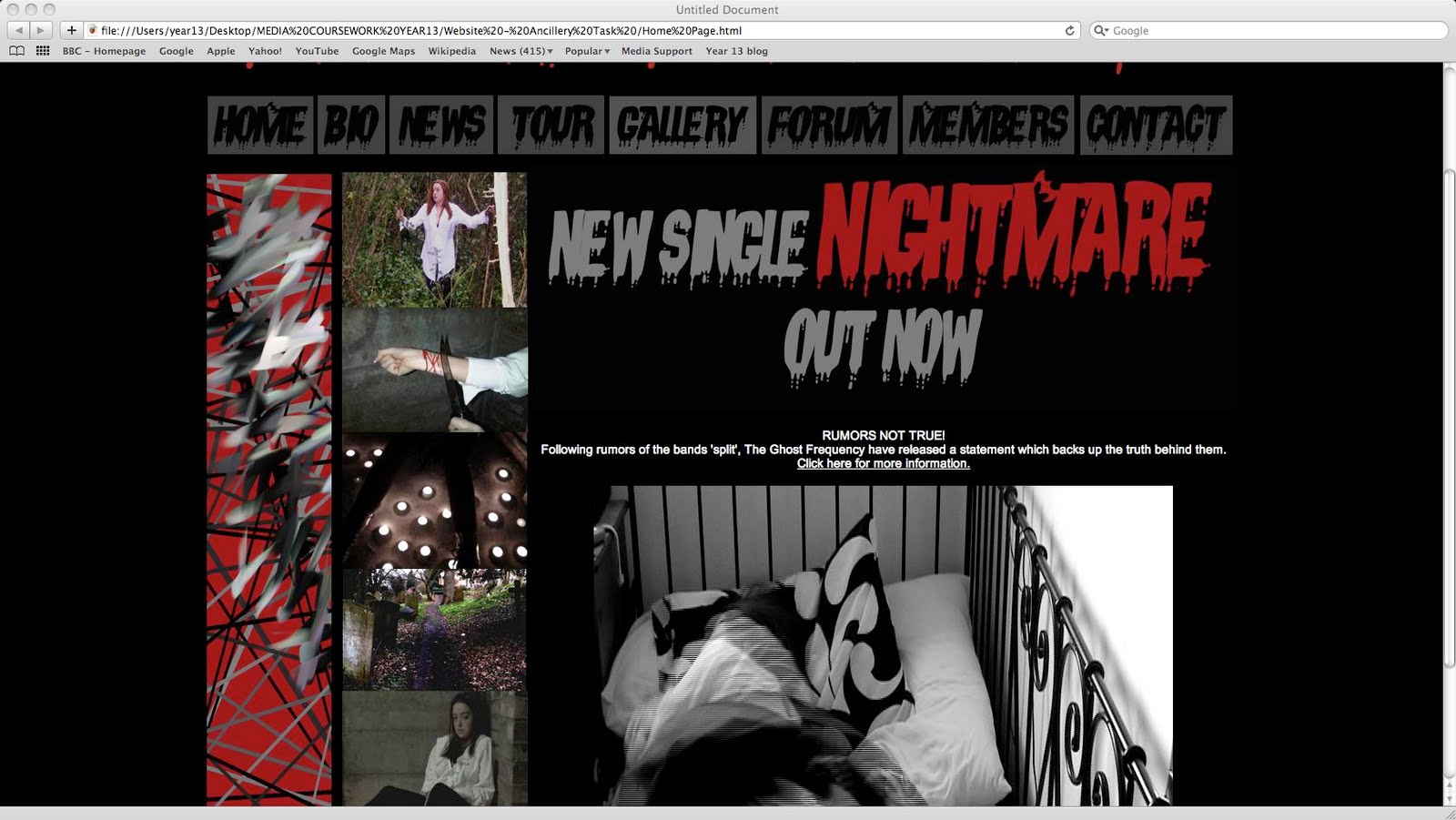
This is the inital design of the website of which I created by myself. By creating this website, I was able to put a lot of time and effort into what I wanted it to look like as well what pictures, images and text I wanted to use.
Although I had had previous experience at using Dreamweaver, I also picked up and used other tools within the programme that I didn't know about before.
The feedback I received for this website was very positive which made me happy as I had spent an enormous amount of time and effort creating this.
The only piece of criticism I got for this design of the webpage is that people felt the image thumbnails should be in black and white like the music video. I took this into account and therefore changed these images as suggested and I felt they instantly made the website appear more realistic.
I thoroughly enjoyed utilising my skills in this area and am proud of what I have achieved.
Ancillary Task - Website Homepage Research

Arctic Monkeys Home Page
This is the website homepage of the Arctic Monkeys.
When I first went onto the website, the first thing that grabbed my attention was the header for the band which read 'Arctic Monkeys'. This really grabbed my attention as the design for it was really interesting and it was big and bold so therefore it was made to stand out amongst the rest of the website.
The homepage also included a silhouette image of the band, which I thought was really original and lead to a mysterious feel about the band, even though people know who they are and what they look like.
Although I felt that the website homepage was very original, I didn't particularly like the links that were included in the website that would allow people to navigate around the site easily. To me, they didn't seem to stand out a lot so that people would be able to easily see that these were the links that they needed to use. I feel that maybe these links didn't stand out because of the colour scheme that has been used throughout the website that is black and white, and these colours didn't allow anything in particular to stand out on the homepage, except the header.

Kings of Leon Home Page
This is the website homepage of the Arctic Monkeys.
I then decided I would look at the Kings of Leon home page. When first clicking onto the homepage, again the header really stood out to me as it incorporated both the image of the band and the title into one, making it stand out even more than just text. I really liked this as it also included colour, which made the page look more interesting.
The homepage also included Tour Dates and Latest News, which I felt were good as people are most likely to be looking at the homepage particularly for this type of information.
When I saw the navigation bar, I felt as if it was slightly too simple as it was just text that once it was rolled over, a drop down would appear, however I felt that the links could have been made a slightly bit more interesting as they were of a simple font that could be found on Word.

Kaiser Chiefs Home Page
This is the website homepage of the Arctic Monkeys.
I then decided I would look at the homepage for the Kaiser Chiefs.
I was really impressed with the way in which the homepage had been designed as it incorporated a live video of the band performing with links. This worked as the video was being played as a big screen, over 9 different little screens. As you scroll over one of these little boxes, the video turns to animation as if it was a TV screen with no single so it was therefore grey and fuzzy with speckles of black. This box then transformed to have a black background and a simple bit of text, which became a link. I thought this was really clever and really original, as I hadn’t seen anything like it throughout my research.
There was also a navigation bar at the bottom of these little boxes, which linked to each of the different pages too so that users didn’t have to use the fancy links if they didn’t want too.
The only thing I felt let the homepage down slightly is that the page didn’t include a header of the band, which is what I would have expected. This means that it is not entirely clear who the website is representing, however it is probably because if you are on the website initially, it is presumed that you would know what band the website is for.
Ancillary Task - Digipak Final Design
 After listening to the feedback and suggestions that we had made as well as others, we decided we would take some action into changing the digipak so that it looked more like a 'real life' digipak.
 Firstly, we changed the images that had been included into black and white so that the images linked all 3 products together. We also created the collage of images that had been taken throughout filming. We also changed the back page of the digipak so that the image was almost like a ball of smoke which then had the song titles on it.
When looking at the final digipak, i particularly like the changes in which we had made to the back page as this changed the design completely and made it look more mysterious and interesting. The text on this page became instantly more readable and altogether, i felt like this page really emphasises the changes in which we had made to get from the initial digipak design to our final one.
Ancillary Task - Initial Digipak
After designing the digipak on paper, we then started to create the Digipak using Adobe Photoshop which was a programme we had previously used, however was able to use many different tools in which we hadnt used before.

This is the original digipak in which Louise had created.
After we had all looked at the design, ourselves, along with our teacher decided that the digipak didn't really go with the rest of the products in which we had created. We felt that the main reason this was is because the images used within the design were in colour and not in black and white like the music video and the images used within the website.
Also, when looking at real life digipaks, we all felt as if our product did not really match up to ones we had previously looked at as it looked as if not much time had been spent on designing it properly.
However, we soon overcome this problem by all adding in ideas that we felt could make the digipak look more appealing. Our first idea was that the images needed to be changed to black and white so that the 3 products all linked to one another as this is a key thing in promoting a product which is what we are doing.
Another idea we added was that little images or screenshots that had been taken throughout our music video could be changed and made into a collage of images. This would add a little curiosity to the digipak as people would want to see the images fully, however wouldn't be able too.
Our last idea was that the back page of the digipak where the Song Titles are added could be changed to be more interesting as it was a slightly boring image, and again didn't really look like it would do in a real life digipak. The text was also difficult to read as it didn't stand out due to the use of colours on this particular page.
Ancillary Task - Digipak Paper Design
After researching about existing digipaks, we decided to start designing the images we wanted to include on our digipak, as well as thinking about the layout and colours in which we was going to use.

This is the front page of the digipak which includes an outline of what we want included on this particular page. From this, we can see that we plan on using an image of a graveyard as the main and only image on this page. However, this draft does not show what colours the image is going to be, whether it is going to be in colour or black and white.
The draft also shows the text that is going to be included on this particular page too. 'The Ghost Frequency' is the main header and 'Nightmare' is the title of this particular digipak. However, as I have said previously, we do not know what fonts are going to be used for this particular page or what colours are being planned to be used. Judging from the way in which this has been drafted, I am presuming that the text colour is going to be black.

This is the draft for the CD itself. It shows how an image of a person (who I am presuming is the main character throughout the music video) is going to be placed on the side in a medium close up so that you can just see their upper body.
Also, some text is going to be included on this CD. This text will be 'The Ghost Frequency', 'Nightmare' and also 'All Rights Reserved City Rockers'. This is a copyright statement that included the name of the current record holders for this particular song.
However, like the previous design, I do not know what colours and fonts are going to be used within this design.

This is the page in which will sit opposite the CD. It shows an image of a person (who again I am presuming is the main character throughout the music video) sitting in the corner which what appears to be candles around them. This image I feel could be potentially a very powerful image, however like all of the other images, we do not quite know whether the image is going to be in colour or in black and white.
All of these designs for drafts of different pages I feel look quite interesting, and could look a lot better on screen. However, i feel as a group we need to sit down and talk about the ways in which all of these are going to be made - whether the images are colour or black and white and what styles and colours the text is going to be. These are quite important matters within this design process.
Ancillary Task - Digipak Research
Before designing the initial digipak, I decided to research into existing digipaks for bands that were remotely similar to the one in which we are promoting.
 The Hoosiers - The Trick To Life
I like the design used in this image and thought the colours contrasted well with one another. However, I didnt understand certain elements of the design and found it confusing. One of these features that I found confusing was that their appeared to be some kind of eyes everywhere throughout the CD cover. I did not quite understand why they were here, and what reference they had to the band or the CD/song.
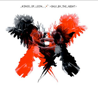 Kings of Leon - Only By The Night
When first looking at this image, I was instantly drawn to it due to its individuality and uniqueness. The contrast of the colours made the image stand out and I wanted to look deeper into it to find out more about it.
However, I found the text to be too small and do not think it related well to the image itself. Arctic Monkeys - I Bet You Look Good On the Dancefloor
When I first looked at this, the first thing I noticed was how young the girl looked.
The colours worked well in the image but the mise-en-scene within the image felt as if it was quite a busy image with a lot going on.
 The Hoosiers - The Trick To Life
I like the design used in this image and thought the colours contrasted well with one another. However, I didnt understand certain elements of the design and found it confusing. One of these features that I found confusing was that their appeared to be some kind of eyes everywhere throughout the CD cover. I did not quite understand why they were here, and what reference they had to the band or the CD/song.
 Kings of Leon - Only By The Night
When first looking at this image, I was instantly drawn to it due to its individuality and uniqueness. The contrast of the colours made the image stand out and I wanted to look deeper into it to find out more about it.
However, I found the text to be too small and do not think it related well to the image itself.
 Arctic Monkeys - I Bet You Look Good On the Dancefloor
When I first looked at this, the first thing I noticed was how young the girl looked.
The colours worked well in the image but the mise-en-scene within the image felt as if it was quite a busy image with a lot going on.
Characters and Costuming
We decided that for our music video, we would only have 2 characters. A main character and a 'vampire' like character.
For these characters we then thought carefully about the costumes in which these characters should wear so that they represented exactly what they were without it being told straight away.
We therefore decided that our main character who was going to be 'living a nightmare' should be dressed in 'normal' type clothing such asa long shirt that could be used as a nightdress.
We also decided that our vampire should wear all black clothing as this would make them appear more mysterious which is what we want to show.


Subscribe to:
Comments (Atom)