 The Hoosiers - The Trick To Life
I like the design used in this image and thought the colours contrasted well with one another. However, I didnt understand certain elements of the design and found it confusing. One of these features that I found confusing was that their appeared to be some kind of eyes everywhere throughout the CD cover. I did not quite understand why they were here, and what reference they had to the band or the CD/song.
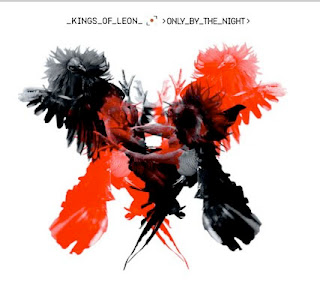
 Kings of Leon - Only By The Night
When first looking at this image, I was instantly drawn to it due to its individuality and uniqueness. The contrast of the colours made the image stand out and I wanted to look deeper into it to find out more about it.
However, I found the text to be too small and do not think it related well to the image itself.
 Arctic Monkeys - I Bet You Look Good On the Dancefloor
When I first looked at this, the first thing I noticed was how young the girl looked.
The colours worked well in the image but the mise-en-scene within the image felt as if it was quite a busy image with a lot going on.

No comments:
Post a Comment