For the tasks in which we were given, we chose to create a music video to 'Nightmare' by The Ghost Frequency. From this, we also had to complete 2 ancillary tasks that would support the music video and the band in which we decided to promote. This meant that our ancillary tasks had to be created, designed and made to the same standard as our music video. To accompany our music video, the ancillary tasks in which we decided as a group to create were a Website Homepage for the band, as well as a Digipak.
Both of these products, as well as our music video had to somehow all link together, so that they become believable that they were promoting this particular band. The way in which we felt this was best achievable was by creating a coherent house style which would then be displayed within all of our 3 products.
In order for our products to create a maximum effect, it needed to target and meet the needs of the target audience. However, for our products to meet the target audience's needs, we needed to research further into what kind of things our target audience enjoy and do.
After looking at the UK tribe website, we soon found how our music video would fit more into the 'Alternative' segment which included stereotypes such as emos, when compared to the 'Mainstream' segment which included stereotypes of chavs. Therefore, as a group we researched into our target audience into what kind of things they enjoy and soon thought about how we would create our music video in black and white, however would include some effects so that there is some slight colour within some of the shots.
Images
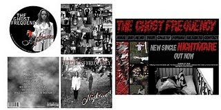
Once the music video rough cut had been created, we was therefore able to look in more depth as to what kinds of effects and colours we liked and what we thought our target audience would like. We was also able to examine the shots in which were featured in the music video as we therefore was able to take some of these shots to use as images within our ancillary tasks.
 Using shots that had been featured within our music video as images within our ancillary tasks easily combined all 3 of the products together as the shots become visible as to where they had come from. This therefore meant that 'random' images were not used for our tasks which could have made the products look completely separate from one another.
As we made our music video, we changed the different shots and scenes into a black and white colour as we went along, however we was also able to screenshot many of the images so that we had copies of them to use.
Originally, we decided to use colour images as the images within our ancillary tasks so that we could try to make the products look slightly different to the music video. However, once we had created first drafts of these tasks, we received some feedback that the images used throughout these tasks did not match the music video well due to the fact that they were in colour. We therefore changed these images in both the website homepage and the digipak so that all the images were in black and white and therefore this made our products link together well.
Font
When decided on what fonts we would use throughout the products, we already realised that to meet the needs of our target audience, we would have to use a font that would be enough to grab their attentions. We therefore realised that whatever type of font we would use, it would have to be 'weird', yet eye catching at the same time.
 We experimented with many different fonts, however as we looked into them further, we realised how none of them matched up to what we really wanted which was big and bold.
After a lot more researching and experimenting with fonts, we soon found one named 'vampyrish' which was big and bold - exactly what we was looking for! However, this one looked more appealing to us as at the bottom of this particular font, it almost looked as if blood was dripping from the letters.
 This font we therefore used as our main title for all of the individual products.
 We wanted to separate the main title from the other titles within the products, such as the song title. However, after more searching we found other fonts that did not over shadow the main title and we therefore decided to use these as they would stand out to the target audience as well as the title.
Font Colours
 We therefore decided we would use a red colour for our fonts as this would represent blood within all of our products.
 Other colours in which we used throughout these products was grey. This is because we felt a grey colour would fit in well with the black and white theme as it is quite a dreary colour too.
 Overall, I am really pleased with the products in which us 3 as a group have come up with as i feel they all include the coherent house style in which we wanted to create to link the products together. I feel they work well together as they clear as to what they are and who they are made for.
Both of these products, as well as our music video had to somehow all link together, so that they become believable that they were promoting this particular band. The way in which we felt this was best achievable was by creating a coherent house style which would then be displayed within all of our 3 products.
In order for our products to create a maximum effect, it needed to target and meet the needs of the target audience. However, for our products to meet the target audience's needs, we needed to research further into what kind of things our target audience enjoy and do.
After looking at the UK tribe website, we soon found how our music video would fit more into the 'Alternative' segment which included stereotypes such as emos, when compared to the 'Mainstream' segment which included stereotypes of chavs. Therefore, as a group we researched into our target audience into what kind of things they enjoy and soon thought about how we would create our music video in black and white, however would include some effects so that there is some slight colour within some of the shots.
Images
Once the music video rough cut had been created, we was therefore able to look in more depth as to what kinds of effects and colours we liked and what we thought our target audience would like. We was also able to examine the shots in which were featured in the music video as we therefore was able to take some of these shots to use as images within our ancillary tasks.
Using shots that had been featured within our music video as images within our ancillary tasks easily combined all 3 of the products together as the shots become visible as to where they had come from. This therefore meant that 'random' images were not used for our tasks which could have made the products look completely separate from one another.As we made our music video, we changed the different shots and scenes into a black and white colour as we went along, however we was also able to screenshot many of the images so that we had copies of them to use.
Originally, we decided to use colour images as the images within our ancillary tasks so that we could try to make the products look slightly different to the music video. However, once we had created first drafts of these tasks, we received some feedback that the images used throughout these tasks did not match the music video well due to the fact that they were in colour. We therefore changed these images in both the website homepage and the digipak so that all the images were in black and white and therefore this made our products link together well.
Font
When decided on what fonts we would use throughout the products, we already realised that to meet the needs of our target audience, we would have to use a font that would be enough to grab their attentions. We therefore realised that whatever type of font we would use, it would have to be 'weird', yet eye catching at the same time.
We experimented with many different fonts, however as we looked into them further, we realised how none of them matched up to what we really wanted which was big and bold.After a lot more researching and experimenting with fonts, we soon found one named 'vampyrish' which was big and bold - exactly what we was looking for! However, this one looked more appealing to us as at the bottom of this particular font, it almost looked as if blood was dripping from the letters.
This font we therefore used as our main title for all of the individual products.We wanted to separate the main title from the other titles within the products, such as the song title. However, after more searching we found other fonts that did not over shadow the main title and we therefore decided to use these as they would stand out to the target audience as well as the title.Font Colours
After choosing what fonts we were planning on using for the products, we then had to decide on a colour in which these fonts would be made.
As our music video was black and white, we had to decide carefully on what colour would work best with a black and white colour scheme. However, after we added the 'sin city' effects to many of our shots, we then had a visible red colour in our music video which symbolised blood.
We therefore decided we would use a red colour for our fonts as this would represent blood within all of our products.Other colours in which we used throughout these products was grey. This is because we felt a grey colour would fit in well with the black and white theme as it is quite a dreary colour too.Overall, I am really pleased with the products in which us 3 as a group have come up with as i feel they all include the coherent house style in which we wanted to create to link the products together. I feel they work well together as they clear as to what they are and who they are made for.I also feel as if our house style is something in which the target audience would want to see as it is black and white which is very simple, however the separate products include a lot of individual details that they may be able to pick up and recognise. Also, the thought of a bit of blood could get everyone intrigued and interested!
No comments:
Post a Comment